subway art
The New York City subway, in analogy to New York City itself, is an old rat-infested hole prone to breakdown and teetering on the edge of operability. Its layout and signage are illogical but somehow comprehensible, its margin for error is just not there … yet, somehow it manages to run. Dirty, smelly, hot in summers, and generally contemptible, it is oddly alive and orderly. People not only put up with it, they adapt to it.
This is one of the nicer stations. Still looks like a 19th century dungeon, though; which of course, it is.

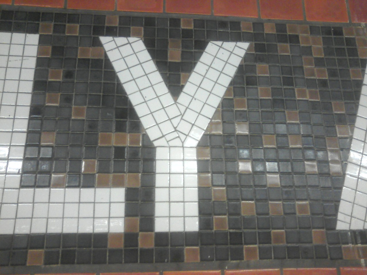
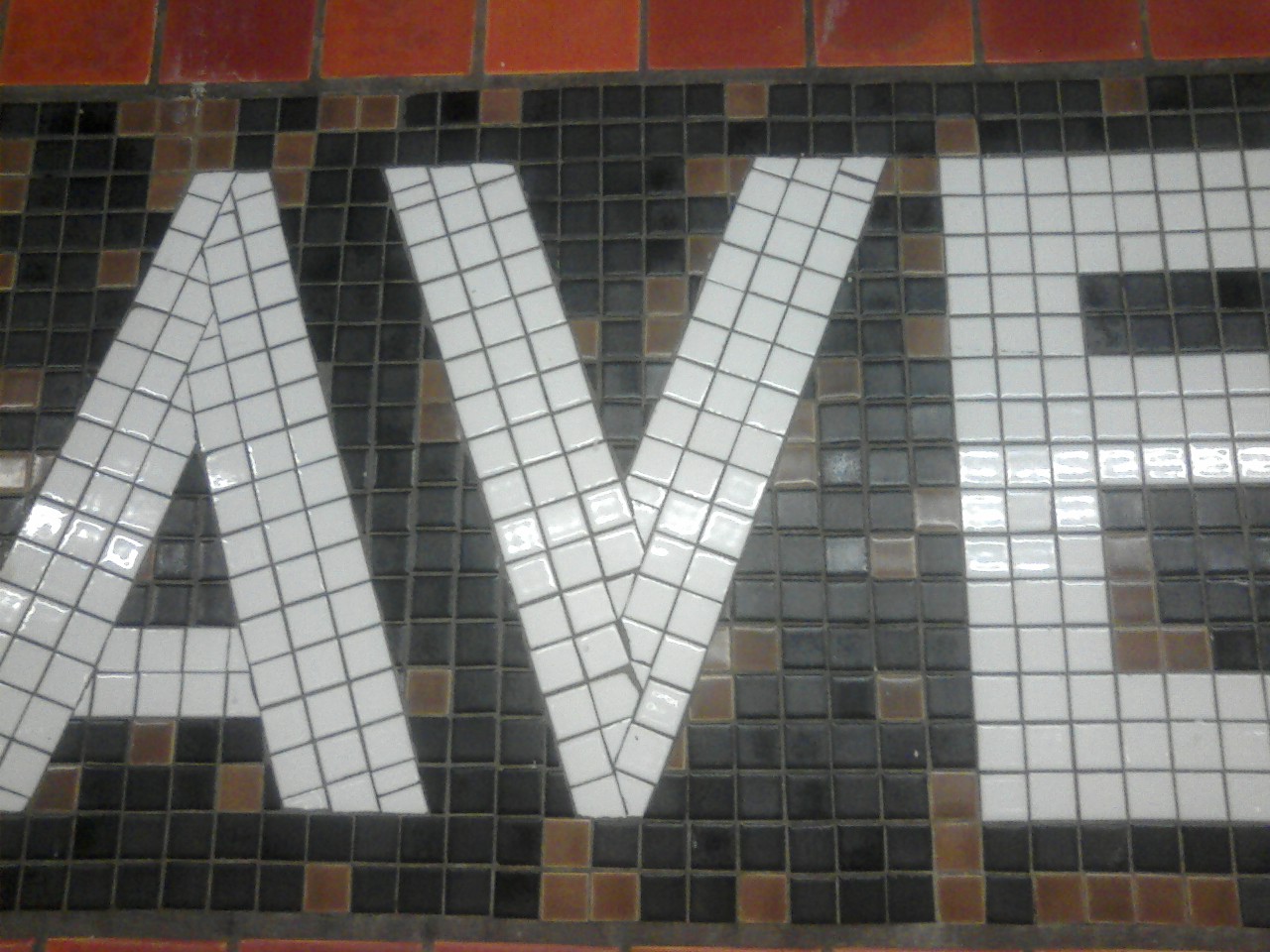
One of the nicest things about the subway stations is the porcelain-tile wall art. Since the trains are always late, one can spend a lot of time observing these oddities.

But have you noticed that it’s not trivial to make these pieces all line up and look nice — because the letter strokes make non-right angles? See how the tile alignments are fudged, near the bend of the letter Y on the left side? There is a long side of a triangular piece aligning with a side of a square piece, where the hypotenuse of the triangle has to be a little bit longer. So they just jam it in there. It sticks out a little bit.
And here is a letter V. Clearly when they do the tiles, they make each line of tiles for the \ strokes before the corresponding / strokes, because the \ tiles run longer.

These were all taken at the station called 23rd and Ely. Of course the station names don’t correspond to where the exits are. One stop at 49th Street actually produces exits mostly on the 47th Street. Another at 42nd Street actually opens onto 40th Street. Go figure. Actually, station names in Manhattan itself are almost consistently “wrong” in this way, which leads me to believe that Manhattan streets have been renumbered at some point.
 Comments(1)
And the platforms are soooo narrow. Kinda dangerous given the crazies out there in this world…and some down in the subways. Stand back!