toward a synthetic universal instrument

The Roland line of “SuperNATURAL” digital pianos claims to produce a more natural sound by combining the two primary methods of synthesizing instruments, namely: acoustic modeling of real instruments, and recording samples from them. The two methods are different enough that, even if both converge to the true output as more sophistication is put to bear, they are rather difficult to merge together.

The history of synthesized instruments has ping-ponged between the two methods. First there was FM synthesis, which used analog function generation based on the simplest physical models of standing waves (harmonics, etc.). This allowed distinguishing between major instrument groups but sounded decidedly fake. Then people recorded acoustic instruments and looped/interpolated between samples — much better, but storage constraints placed limits on what could be processed; and there was never any dynamism. Then it was back to physical modeling, this time using waveguides to determine how various inputs like bowing on strings or blowing into pipes dynamically affect output sound (I think it started at CCRMA). This gave really good expressivity — but again sounded fake. And so back to wave-samples. For the last 15 years or so, especially with the cheapening of storage, it appears that the dumbest, brute-force method of using a large enough number of samples and ad-hoc adjustments to their decay and reverb characteristics became dominant. For ensemble instruments with little individual personality, it was actually superb. The trouble was always with instruments in solo.
(Read the article)

tensors

This has been a confusing topic, with half a dozen Wikipedia pages on the subject. Here I took some notes.

Tensors are sums of “products” of vectors. There are different kinds of vector products. The one used to build tensors is, naturally, the tensor product. In the Cartesian product of vector spaces \(V\times W\), the set elements are tuples like \((v,w)\) where \(v\in V, w\in W\). A tensor product \(v\otimes w\) is obtained by tupling the component bases rather than the component elements. If \(V\) has basis \(\{e_i\}_{i\in\{1,…,M\}}\) and \(W\) has basis \(\{f_j\}_{j\in\{1,…,N\}}\), then take \(\{(e_i,f_j)\}_{i\in\{1,…,M\},j\in\{1,…,N\}}\) as the basis of the tensor product space \(V\otimes W\). Then define the tensor product \(v\otimes w\) as

(1) \(\sum_{i,j} v_i w_j (e_i,f_j) \in V\otimes W\),

if \(v=\sum_i v_i e_i\) and \(w=\sum_j w_j f_j\). The entire tensor product space \(V\otimes W\) is defined as sums of these tensor products

(2) \(\{\sum_k v_k\otimes w_k | v_k\in V, w_k\in W\}\).

So tensors in a given basis can be represented as multidimensional arrays.

\(V\otimes W\) is also a vector space, with \(MN\) basis dimensions (c.f. \(V\times W\) with \(M+N\) basis dimensions). But additionally, it has internal multilinear structure due to the fact that it is made of component vector spaces, namely:

\((v_1+v_2)\otimes w = v_1\otimes w + v_2\otimes w\)
\(v\otimes (w_1+w_2) = v\otimes w_1 + v\otimes w_2\)
\(\alpha (v\otimes w) = (\alpha v)\otimes w = v\otimes (\alpha w)\)
(Read the article)

Google+ and its circles, a user-graph evolution

Eduardo … I’m talking about taking the entire social experience of college and putting it online.

When the movie “The Social Network” came out, this line caught my attention. I’m not sure this thesis — let’s call it the “replication thesis” — was what Monsieur Zuckerberg had in mind rather than something the screenwriter came up with, but it makes sense as to what actually undergirds online social platforms of today.

In all likelihood, Zuckerberg did not at first intend Facebook to be more than its namesake — a dorm facebook. Just as, in all likelihood, Twitter was meant as no more than a status message broadcast system, at first. The fact that Facebook became something of a gathering place and Twitter became a “microblogging” service — in essence, taking over functions that used to be conducted in other ways — I think owed something to their use of a “correct” user graph for certain contexts. It was the user graph that allowed, then limited, the range of social functions that people were willing to port over to the online platform. With the undirected graph, Facebook (and clones) modeled something like a big gathering, maybe a party. With the directed graph, Twitter (and clones) modeled something a bit more nuanced, like a groupie-celebrity relationship. (Is it any surprise, then, that celebrities drove the latter’s popularity?)

But I get the sense that neither Facebook nor Twitter truly believes in the replication thesis. They’ve construed their challenge narrowly as one of periodically pushing out new “things you could do,” most of which are nowadays ignored by users, or adding more places at which you could interact, but in the same way. They don’t see that users voluntarily do on a platform only those things that are compatible with their perception of the modeled social space. You can’t push anything on them any more than you can force people to play some game at a party. Yet I see no movement to revisit the user graph and better model real social relationships with all of their complexities. If left unchanged, the inevitable result will be that the range of social functions these platforms support stagnates, and therein should lie their eventual downfall. In fact, that probably solves the supposed “mystery” of Myspace’s decline, too. It is in this context that Google+ arrives.
(Read the article)

subway oddity

http://farm4.static.flickr.com/3469/3736606417_a8d6963aa2.jpgMBTA has these “BIG RED” high-capacity cars now, but guess what? All they did was to remove all the seats. The trouble is, this form of so-called “high capacity” doesn’t actually add much capacity. You still have to hold on to these loops or bars and there are only so many of them. The trains look more spacious though… I think they’re confusing high personal space with high capacity.
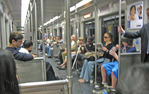
http://www.boston-discovery-guide.com/image-files/boston-subway-8.jpg (Why do “suit” and “purple” choose to stand?)

There is a better way to add capacity and reduce crowding in the subway car, however. Make the damned seats wider! What people do right now — due to some kind of human repelling force — is to skip every other seat unless the situation is really saturated, because it’s impolite and uncomfortable to squeeze next to/in between people. So MBTA ends up with half the designed seating capacity and the overflow just stand, sometimes right next to/blocking an empty seat. Just remove one seat per row and the number of seated people may increase dramatically. This applies to classrooms and other contexts, too.

on transparency, dynamic wallpaper, 3d desktops

With Windows 7 about to arrive, I’ve been thinking about supposedly “cool” UI trends of recent years that actually annoy me greatly.

Beginning a few years back, when graphics cards in computers not used for games became powerful enough to do something interesting, out came features that tried to take advantage of this power. I’m talking about things like circular windows, transparency, video wallpapers, flipping window previews, 3d desktops, like a cube or whatever…

Now trust me. Since I don’t play games, I’ve thought about using the idle GPU for other purposes, too. So I tried the above features. And they all suck. Greatly. (I also tried GPGPU but that’s a rant for another day.)
(Read the article)