senate voting model graph
There was a talk today that referenced this paper by Banerjee, El Ghaoui, and d’Aspremont on obtaining sparse graphical models for parameterized distributions.
This undirected graphical model stating conditional independence relationships of senate voting behavior was shown.
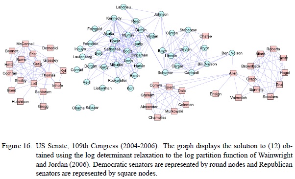
If two nodes A and B are connected only through a set of nodes C, then A and B are independent, conditioned on C. Basically it says if you want to predict anything about B from A and C, then C is enough, because A won’t tell you anything more. As pretty as the graph looks, this is a rather odd visualization. Without seeing the (Ising) model parameters, especially where the edge weights are positive or negative, this graph is hard to interpret, and the conclusions in the paper are especially questionable to me. In particular, being in the middle of this graph does not necessarily imply “moderation” or “independence”, (unlike in let’s say this graph). We would expect moderates to exhibit weak dependency to either party’s large cliques. But if, for example, the edge weight between Allen and B. Nelson is a strongly negative one (which it very well may be, since the two parties are not otherwise connected via negatively weighted edges), then the graph seems to imply that how the two parties vote can largely be predicted from the votes of the likes of Allen or B. Nelson; in that sense, they are the indicators for their parties, disagreeing on exactly those party-disambiguating issues.
There is some additional funny stuff going on. According to the paper, a missing vote counts as a “no” because they only solved the problem for binary and Gaussian distributions. I also count only about 80 nodes in there, while there are 100 senators. The graph structure also seems a bit too sparse, but this may be intentional, in order to drop weak dependencies from the graph. One does wonder though, whether the results weren’t really that good without manual fudging.
Unrelatedly, this reminds me of another famous academic paper graph, the high school dating graph:
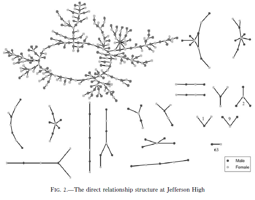
If you look carefully, there is some oddball stuff going on here, too.
