good, bad, and ugly of windows 7

I went ahead and installed it. Windows 7 is compelling, but still, it has been overhyped.

Good:

  1. I get the impression that most reviews became enamored with the new task bar, which, while compelling and does save a lot of time, is not entirely critical to me.
  2. If the tablet functions of Vista were its only must-have features, then the alternate input improvements are the key selling points of Windows 7 for me. Here we have much improved Chinese handwriting recognition and speech recognition (in particular, dictation) in multiple languages. These have passed the critical threshold of being useable and indeed I can say they are better than keyboard input. That is no small feat.
  3. Math input panel, as mentioned previously, is not quite up to par yet, but I can see a lot of potential. While it is faster than typing straight LaTeX, it is not faster than LyX. But for labeling figures, this is perhaps useful.
  4. PowerShell, i.e. Monad, is beautiful.
  5. The volume controller has been restored to usefulness, with audio loopback for devices now possible.
  6. Libraries could be a very useful feature, but seems to be lacking something that helps ease their management.
  7. Per-file versioning (from system restore) should be very helpful.

Bad:

(Read the article)

elevators

I wonder why elevator buttons aren’t toggle buttons… Many a time the wrong button is pressed and the elevator must then take the extra time to stop, when cancelling the mistake would have been quick and efficient.

This has got me thinking about elevator algorithms (i.e. real elevator algorithms, not the elevator algorithm).

balloon boy?

Can the balloon boy’s family still get a reality show?

That has to be the least self-aware question of all time…

Hasn’t this thing already become a reality show? By that I mean, all the participants are running it like one…

people say

an interesting variation of the rather dull original version…

on transparency, dynamic wallpaper, 3d desktops

With Windows 7 about to arrive, I’ve been thinking about supposedly “cool” UI trends of recent years that actually annoy me greatly.

Beginning a few years back, when graphics cards in computers not used for games became powerful enough to do something interesting, out came features that tried to take advantage of this power. I’m talking about things like circular windows, transparency, video wallpapers, flipping window previews, 3d desktops, like a cube or whatever…

Now trust me. Since I don’t play games, I’ve thought about using the idle GPU for other purposes, too. So I tried the above features. And they all suck. Greatly. (I also tried GPGPU but that’s a rant for another day.)
(Read the article)

bank of america

Well, it gets resolved (in the stupidest way), if you’re patient.


Welcome to an online chat session at Bank of America. Please hold while we connect you to the next available Bank of America Online Banking Specialist. Your chat may be monitored and recorded for quality purposes. Your current wait time is approximately 2 minutes. Thank you for your patience.

We are currently experiencing a high volume of chat sessions. All Online Banking Specialists are currently assisting other customers. We apologize for any inconvenience. Thank you for your patience.

Thank you for choosing Bank of America. You are now being connected to a Bank of America Online Banking Specialist. (Read the article)

on ugly cars

From the internet

every time my mother sees a honda element or a mini cooper, she goes,

“oooooh, it’s one of those hybrid vehicles, like the prius”
“mom, just because it’s ugly doesn’t mean it saves gas”
“oh”

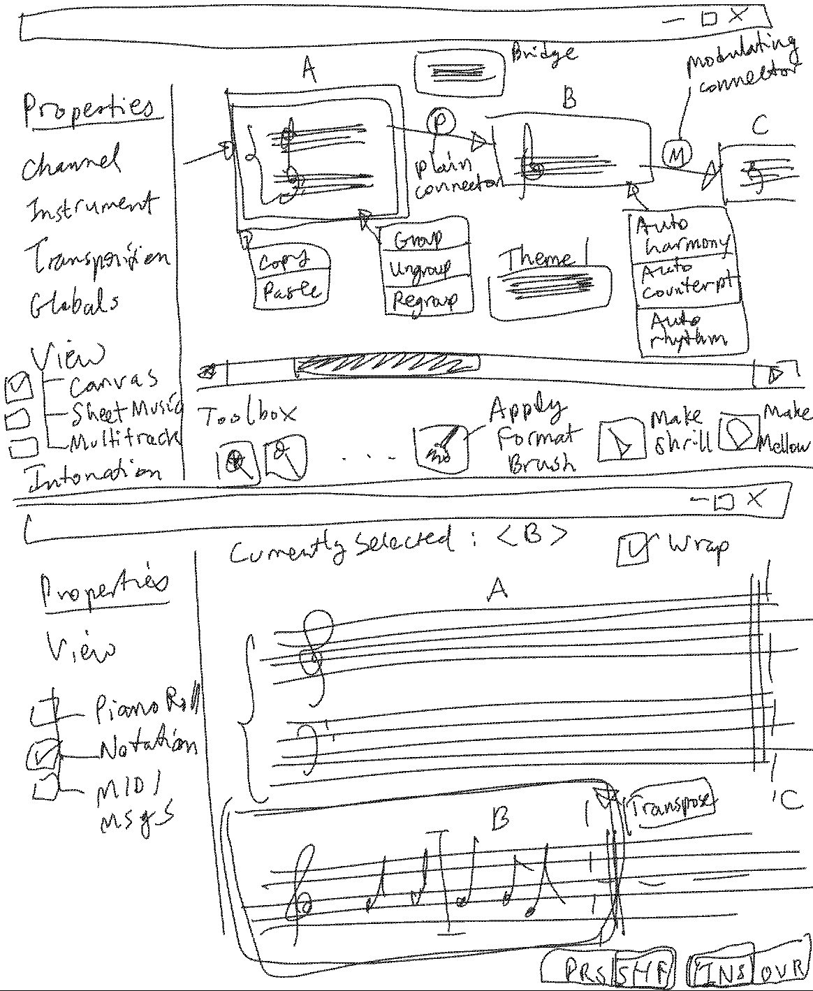
notation software that makes sense

It seems all notation software have an identity crisis. They don’t know if they should be audio processors, sheet music typesetters, or MIDI players. None of the above are particularly useful for composition, which, like photo-editing (a la Photoshop), movie-making (a la Premiere), essay-writing (a la Word), is a non-linear exercise. A non-linear editing metaphor along with some machine intelligence to actually help the process rather than hinder it, is needed. It doesn’t need to be fancy with BS features like VST and these silly knobs for making effects. But it needs to get the basics working well.

A vague and incomplete sketch of what this may look like… self-explanatory:

Malawian who built windmill

William Kamkwamba builds windmill.

When I first came across this I thought — did he regulate the output in any way? Probably not. Then I saw this from Amazon’s preview of “his” book (it was almost certainly ghost-written):
(Read the article)

reed pipe harmonics

It seems that putting the reed against the upper lip gives a different tone.
Putting teeth on the reed also gives extremely high harmonics — understandable, as the reed is being high-pass filtered at that point.

« Previous PageNext Page »